How should I prepare images for my online shop?
Follow this guide on how to prepare images for your online shop, and avoid parts of your product images getting cropped off, when viewed on the website.
If the photos you take vary in size and orientation, your website is likely to look very disjointed.
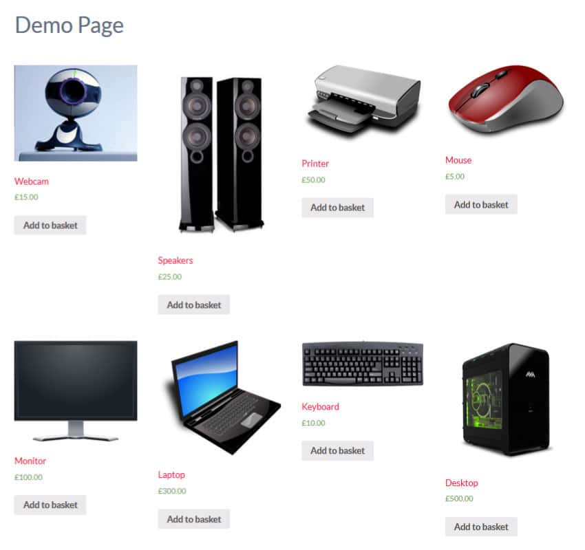
In the example below, you can see that because the images vary in height, the product details below each image, don’t line up.

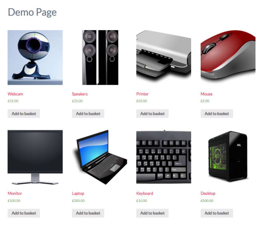
We prevent this by turning a setting on, called “hard crop”. The effects of this can be seen below…

Everything lines up now, but the entire product can’t be seen in all the images, which almost looks as bad as our original problem.
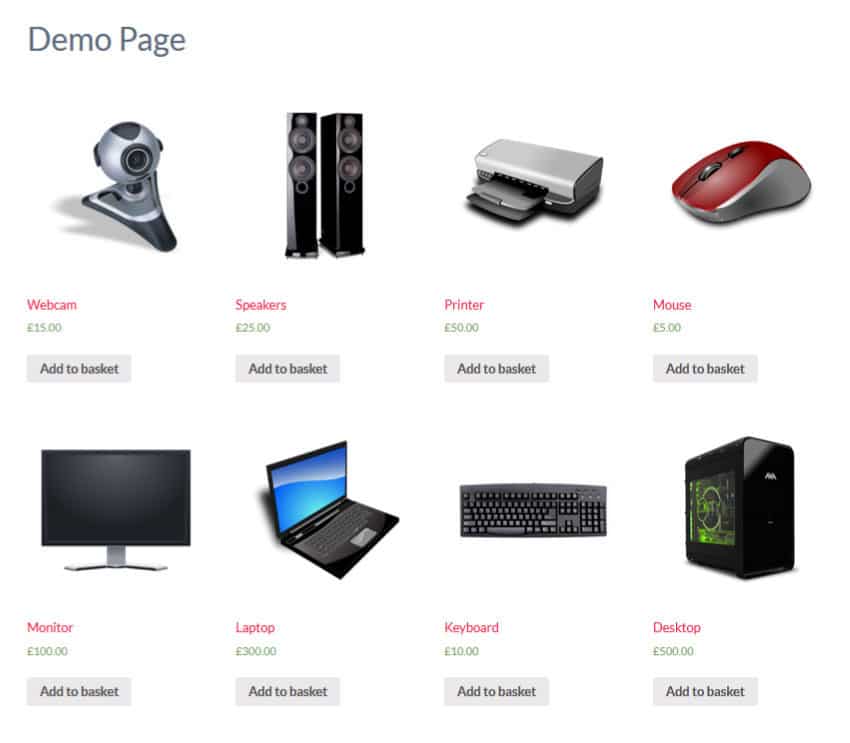
Making sure all of your images are the same size and orientation before you upload them, will prevent these problems and your online shop will look a lot better, as shown in the example below.

You may have noticed that I swapped the image of the webcam for one on a white background. This is because it’s easier to adjust the dimensions of an image, when on a plain background. Making sure all of your images are on a plain background, will not only make them easier to work with, but the overall look of your online store will be a lot better.
There are various ways to achieve the plain background for your photos, such as hanging a white sheet behind where the photo is being taken; taking the photos up against a plain wall; or you may want to consider investing in a light tent.
It’s rare all of your products will suit a certain orientation, which is why it’s often best to use square images throughout the site and have extra space either above and below or to the left and right.
It’s unlikely your camera will take square photos, so when photographing your products, leave space around the product, so that the product fits within a square shape. By doing this, when the e-commerce software “hard crops” your image into a square, all of the product will still be seen.
If all of your products will definitely be either portrait or landscape, we can design your site to suit this and you just need to leave some space around your product, so that it’s not touching the edge of the photo.
Our e-commerce websites have four different sizes of products images, which are thumbnail; catalogue; product; and full size. The e-commerce software we use automatically creates the different sizes, from the full size image you upload.
We find that 1500px wide is ample for a full size product image. You don’t want to make them too big, because the file size will increase and make your website slow to load. Based on this, all your images should be 1500px wide by 1500px high, if your website has been designed to display square product images. If your website has been designed to work with portrait or landscape product images, make the longest side 1500px.
The most appropriate file type for your photos is JPEG and we recommend setting the quality to 60%. Reducing the quality to 60% will be barely noticeable to the user and will reduce the file size, making the photos quicker to load, which will improve your search engine optimisation. JPEG files can end in .jpg or .jpeg and although it’s not essential, it’s best practice to use the 3 character .jpg extension and keep it lowercase. It’s likely your computer will hide file extensions and if this is the case, don’t worry about trying to make any of these changes, but if your camera allows you to configure your JPEG file extension, we’d recommend following this advice when preparing images.
For instructions on how to resize your images, use the appropriate link below, depending on if your using a Windows or Mac computer.
– Resizing Photos on a Windows Computer
– Resizing Photos on a Mac Computer
If you have any further questions on preparing images, or any of the links in this article aren’t working, please get in touch and let us know.
